
Overview
Streamlining complexity, restoring clarity, and enabling role-based experiences across an institutional survey ecosystem.
SurveyBox is the internal survey platform used at SDA Bocconi. After years of organic growth, it suffered from inconsistency, cognitive overload, and unclear workflows. I redesigned the platform end-to-end, bringing structure to an undocumented system and improving usability for faculty, students, and the Learning Lab.

Context
A platform that expanded organically without structure, consistency or a clear ownership model.
SurveyBox grew over time through multiple contributors, with no unified vision or design system. This created duplicated patterns, unclear flows and unpredictable interfaces. Faculty dealt with slow and confusing creation processes, the Learning Lab handled heavy manual workloads, and students experienced inconsistent navigation. A redesign was needed to restore coherence and prepare the system for future growth.
.png)
User Research
Understanding the real ecosystem reconstructing roles and workflows in an undocumented institutional system.
Although different user groups existed within SurveyBox, their roles, responsibilities and workflows had never been formally documented. I rebuilt the ecosystem from scratch by analysing how each group interacted with surveys across creation, distribution, classroom use and analysis. This revealed friction points, hidden dependencies, duplicated responsibilities and the origins of cognitive overload across the platform.


System Analysis
Uncovering undocumented workflows and how a single interface was trying to serve completely different user needs
The platform treated all actors the same, exposing them to identical screens regardless of purpose. Faculty saw operational tools meant for the Learning Lab, students encountered administrative elements not intended for them, and internal staff lacked dedicated spaces. By mapping the real workflows, I identified hidden dependencies, role conflicts and structural inconsistencies that directly impacted performance and clarity.

Catalog

Control panel

Control panel - teachers
Key Problems
Lack of role logic, unclear hierarchy and no progressive disclosure created unnecessary noise and operational inefficiencies
Without differentiated permissions or boundaries, SurveyBox surfaced too much information to everyone. Users navigated overlapping flows, irrelevant pages and inconsistent patterns. This increased cognitive load, slowed down every task and made the platform difficult to maintain. The absence of a visual and structural foundation prevented scalability and limited autonomy for all actors.

Catalog

Control panel

Control panel - teachers
UX Strategy
Introducing role-based experiences and using progressive disclosure to simplify tasks and reduce cognitive overload
I redefined responsibilities and redesigned the information architecture so each user sees only what is relevant to their specific role. Progressive disclosure was introduced to break down complex tasks, present information gradually and guide users through predictable steps. This approach clarified hierarchy, reduced confusion and increased autonomy for faculty, students and the Learning Lab.

Role-based interactions

Information Architecture (Learning Lab POV)

Information Architecture (Learning Lab POV)
Co-Design
Aligning faculty and internal teams through workshops, shared decision-making and clear communication of design logic
I facilitated co-design sessions with faculty and the Learning Lab to validate flows, surface needs and align expectations. These workshops exposed hidden assumptions and ensured the redesign matched real academic and administrative practices. To support adoption, I created short explanatory videos that communicated the logic behind the new structure, accelerating understanding and spreading innovation across the organisation.

(1) Hero - house scrolling down

(1) Hero - house scrolling down
UI Redesign
Sharper hierarchy, cleaner layouts, and predictable user flows.
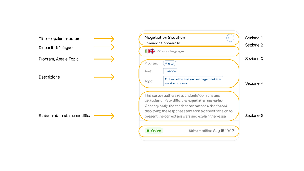
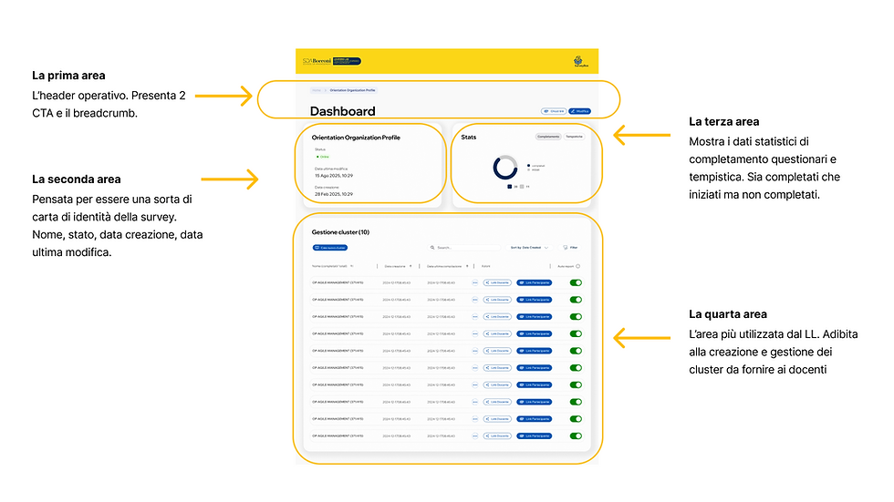
The visual redesign improved hierarchy, readability, spacing, and the overall structure of every screen. Navigation was reorganized into a clear and predictable system, with simplified flows for creating surveys, managing distribution, and accessing data. I focused on usability first: fewer clicks, fewer ambiguities, and more autonomy for every actor involved.






Impact
Delivering faster workflows, clearer navigation, stronger autonomy and a predictable experience for every actor involved
• Significant reduction in survey creation and distribution time
• Clear role separation and tailored interfaces
• Less cognitive overload and fewer errors
• Improved collaboration between faculty and the Learning Lab
• Scalable components ready for future expansion
• Consistent, simplified student interfaces

SDA Bocconi — Driving Digital Transformation in Survey Management at a Leading Business School.
Redesign an internal survey management tool for SDA Bocconi to remove bottlenecks, streamline processes, and empower faculty with autonomy over survey creation and distribution.


Goals and What I learned
I had the possibility of seeing and living the atmosphere of a very big and international environment.
I learned how to move in a structured and layered environment. I learned how to propose change and get aligned every different stakeholder.
I learned the importance of knowing back-end and technical related aspects in order to create a real and impactful User Experience.