

Overview
Building a premium digital identity to inspire trust and clarity.
Lucrhome was designed to give a new short-rent company a clear and bold online presence. The focus was on crafting a minimal yet strong visual language, fast navigation, and smooth interactions that reflect the brand’s lifestyle positioning.


Branding & Design
Using color theory and visual hierarchy to build a distinctive identity and guide user attention.
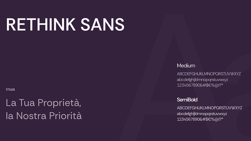
For Lucrhome I applied Itten’s contrast of quality by working with one main hue and its tonal variations, creating a soft yet distinctive visual identity. Neutral shades balance the design, while bold accents highlight key actions. Typography combines Rethink Sans for strong headlines and CTAs with Quicksand for paragraphs, ensuring clarity and a friendly tone.


Experience & Interactions
Designing movement, structure and interaction to guide users naturally through the content.
In this section, I used interaction design to create a smooth and engaging navigation flow. The hero scroll with the house image gently draws users into the experience, setting a strong first impression. The three service cards with glassmorphism and sticky scroll give depth and structure, encouraging users to explore each step without feeling overwhelmed. Finally, the case study cards slide in from the sides to create rhythm and highlight key content progressively, making the page feel dynamic, but never chaotic.

(1) Hero - house scrolling down

(2) Service Cards - Glassmorphism on Scroll

(3) Case Studies - Cards on Scroll
Extra
Nominated on Awwwards for design excellence.
Lucrhome was published and nominated on Awwwards, receiving positive feedback from the community. This recognition reflects the project’s strong visual identity and clean user experience.
