
Hygrow — Building a digital foundation for artisanal self-watering terracotta vases.

Overview
Turning a new product idea into a clear digital presence.
Hygrow needed a first digital presence to make its self-watering terracotta vases easier to understand, discover and remember. The project focused on building a responsive website that could introduce the product, communicate its benefits and give the brand a more structured online identity before moving toward e-commerce.


Strategy
Designing the first digital touchpoint before e-commerce.
Since Hygrow is still in an early stage, the website was designed as a strategic launch layer rather than a traditional online shop. The focus was on explaining the product, building trust and preparing users for a future purchasing experience.
The scroll experience becomes the core narrative device: instead of static information blocks, the user is guided through a progressive story where each scroll answers a specific question. What is it? How does it work? Why does it matter?
The structure helps visitors quickly understand the key promise: a handmade terracotta vase that collects and releases water intelligently, supporting autonomous plant hydration for up to one month.


Product Storytelling
Making a technical product feel simple, warm and desirable.
One of the main challenges was translating the product mechanism into a clear and accessible story. Hygrow combines craft, material intelligence and everyday usefulness, so the website needed to explain the function without making the experience feel too technical.
The scroll structure allows complexity to unfold gradually: first the emotional benefit, then the practical explanation, then the material logic behind it. This layered storytelling makes the product easier to understand and more engaging to explore.
The copy and visual hierarchy were designed to connect practical benefits with a more emotional product narrative: less stress, more autonomy and a more natural relationship with plants.

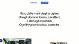
(1) Hero - Slide-in animation

(2) Components - Mouse hover, glassmorphism and inverted mouse tracking

(3) Products - Horizontal scroll
Brand & Visual Direction
Balancing craft, freshness and digital clarity.
The visual direction was built around a clean and bright interface, allowing the product colors and materials to stand out. The design keeps the experience simple and direct, while using spacing, typography and visual rhythm to support the scroll narrative.
As the user moves through the page, the visual system subtly shifts emphasis: from hero impact to detail focus, from product clarity to contextual storytelling. This creates a sense of progression without overwhelming the user.
.png)


Website Design
A responsive website designed to make the product understandable through scroll.
The website was designed in Wix Studio with a clear structure, strong visual hierarchy and a scroll-based flow that guides the user through the entire narrative.
Each section is intentionally paced to answer a specific question, creating a rhythm of discovery: introduction, explanation, detail, proof, and next step. The design avoids fragmentation and instead relies on continuity, allowing the user to stay immersed in the story.
The experience is intentionally simple, but built to grow. The current website works as a launch and validation platform, while the structure can evolve into a future e-commerce experience.